Landing Page Creation: 7 Elements That Turn Visitors Into Customers
A landing page isn't a digital flyer. Seven critical elements that make the difference between a page that generates leads and one that gets ignored.
A landing page isn’t a digital flyer. It’s the first real conversation with a potential customer, and it has exactly one goal: to move the visitor toward a specific action.
But many landing pages miss the mark. They distract, confuse, or fail to build meaningful trust. It doesn’t have to be that way.
This article breaks down the seven essential elements that turn your landing page from a digital business card into a real conversion machine. Whether you’re a tradesperson, service provider, or agency, the principles are the same.
1. A Headline That Names the Problem
The headline is the first thing a visitor sees. You have about 3 seconds for them to decide whether to stay or leave.
Bad: “Welcome to MASTERWORKS Hamburg GmbH & Co. KG”
Good: “Your heating isn’t working? We’ll be there in 2 hours.”
The principle: The headline must address the visitor’s problem or desire — not your company name. The name comes later, once trust has been established.
Check for your landing page: Would someone unfamiliar with your audience immediately understand what you offer? If not, sharpen that headline.
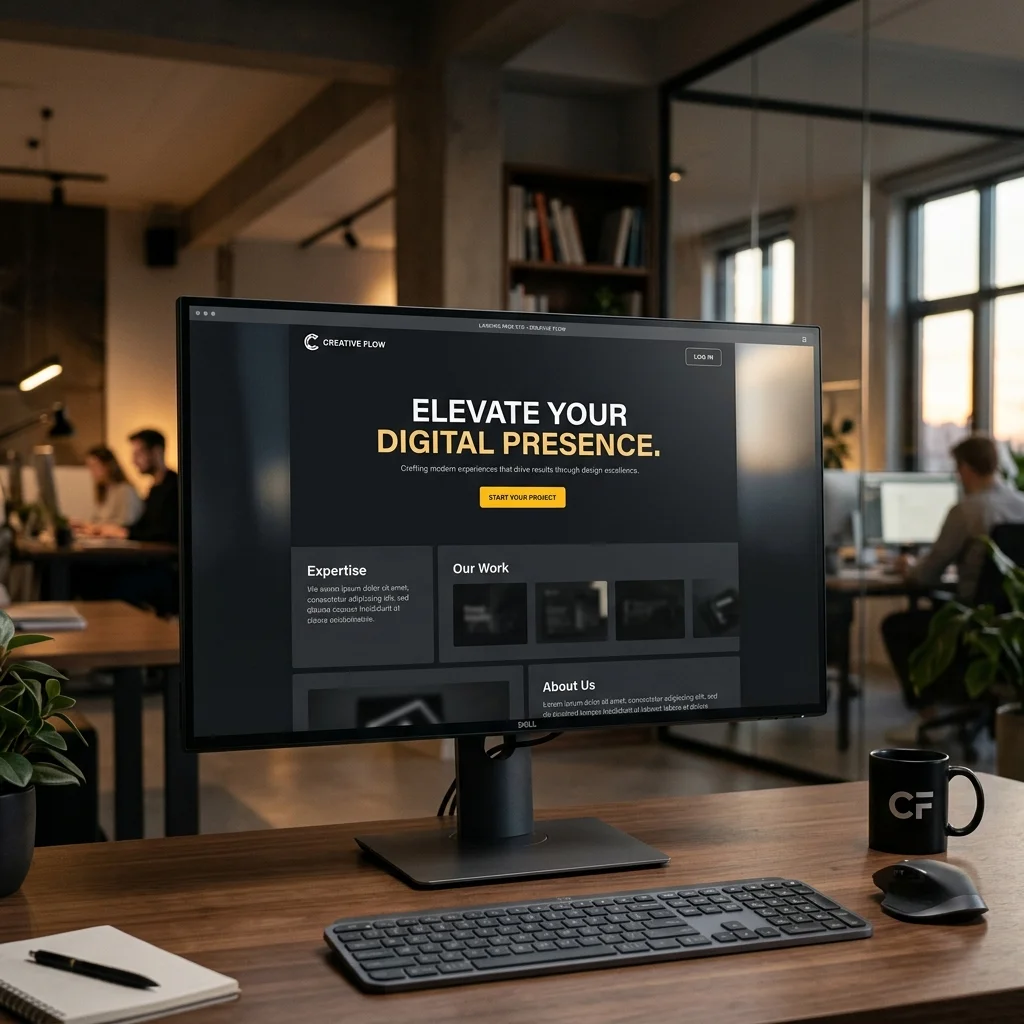
2. A Subheader That Makes the Offer Concrete
The headline sparks interest. The subheader makes it clear exactly what’s on offer. In one or two sentences.
Example for a landing page for tradespeople:
Headline: “Your website live in 5 days.”
Subheader: “Professional landing page with imprint, Google optimization, and contact form — from €399 one-time.”
The subheader is where you put the core service and the price. No generalities — concrete facts that let the visitor make an immediate decision.
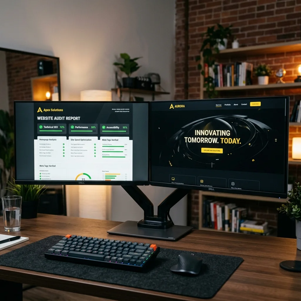
3. Visual Proof That Shows What the Customer Gets
People don’t buy what they don’t understand. An image, screenshot, or a short demo of the result is often worth more than a thousand words.
What works:
- Before & After: A screenshot of the old vs. new website
- Mockup: The landing page on a smartphone screen
- Video: A 30-second explanation of what the customer receives
The proof must show what the customer will have after the collaboration, not how you work.
4. Three to Five Compelling Arguments
Once the headline and proof have sparked interest, it’s time for concrete arguments. Not in dense paragraphs, but as bullet points.
Bad: “We place great value on a collaborative partnership and support you from the initial idea through to final implementation.”
Good:
- Full service: from concept to launch
- Fixed price, no hidden costs
- Optimized for smartphones and Google
- Includes imprint, privacy policy, and hosting
Each bullet point is a concrete promise. The visitor should grasp at a glance what’s included in the offer.
5. A Clear Call-to-Action
The button is the most critical point on the entire page. This is where interest either turns into action or fades away.
Three rules:
- Say exactly what happens. “Request your free quote now” is better than “Learn more.”
- Make the benefit clear. “Check your website in 30 seconds” instead of “Submit.”
- One button, one action. Two buttons confuse. A landing page has exactly one goal.
The optimal CTA button is high-contrast, action-oriented, and immediately visible without scrolling (above the fold), but also visible again at the bottom of the page.
6. A Short Form (or Direct Contact Option)
If conversion runs through a form: the fewer fields, the higher the completion rate.
| Fields in the form | Approximate conversion |
|---|---|
| 3 fields (name, email, message) | approx. 5–8% |
| 6 fields (plus phone, company, ZIP) | approx. 2–4% |
| 10+ fields | approx. 0.5–1% |
Rule of thumb: Only ask for what you really need for the next step. Everything else comes later.
Better than a form is often a direct phone number or a “Call now” button — especially for tradespeople and local service providers.
7. Trust Signals (Reviews, Logos, Seals)
The less known you are, the more important trust signals become. They tell the visitor: “Others have done this before and were satisfied.”
What works:
- Real customer reviews (with name and location, not anonymous)
- Logos of well-known customers or partners
- Google reviews (live star ratings)
- Press mentions or industry portal features
- Certifications or memberships (Chamber of Commerce, trade associations)
Trust signals belong between arguments and CTA — right where the visitor is about to make a decision and might still have doubts.
The Order Matters
A landing page is a flow of arguments. The visitor moves through it in seconds:
- Headline → Problem recognized? (3 seconds)
- Subheader → Offer understood? (5 seconds)
- Proof → Looks like what they want? (3 seconds)
- Bullets → Compelling arguments? (10 seconds)
- Trust → Are others satisfied? (5 seconds)
- CTA → Act now? (2 seconds)
Each element builds on the previous one. If one is missing, the argument chain breaks and the visitor leaves.
When you have a professional landing page created, every one of these elements is systematically aligned toward the conversion goal.
Conclusion
A landing page isn’t a design project. It’s a communication tool with a clear objective. These seven elements help you systematically optimize the page — no gut feeling, no guesswork.
And the most important tip to close: Test. What works for one business may not work for another. Change one element, observe the effect, iterate. That’s the difference between a good landing page and a successful one.
👉 Get your landing page reviewed for free. I’ll look at your current page and tell you which element has the biggest leverage.